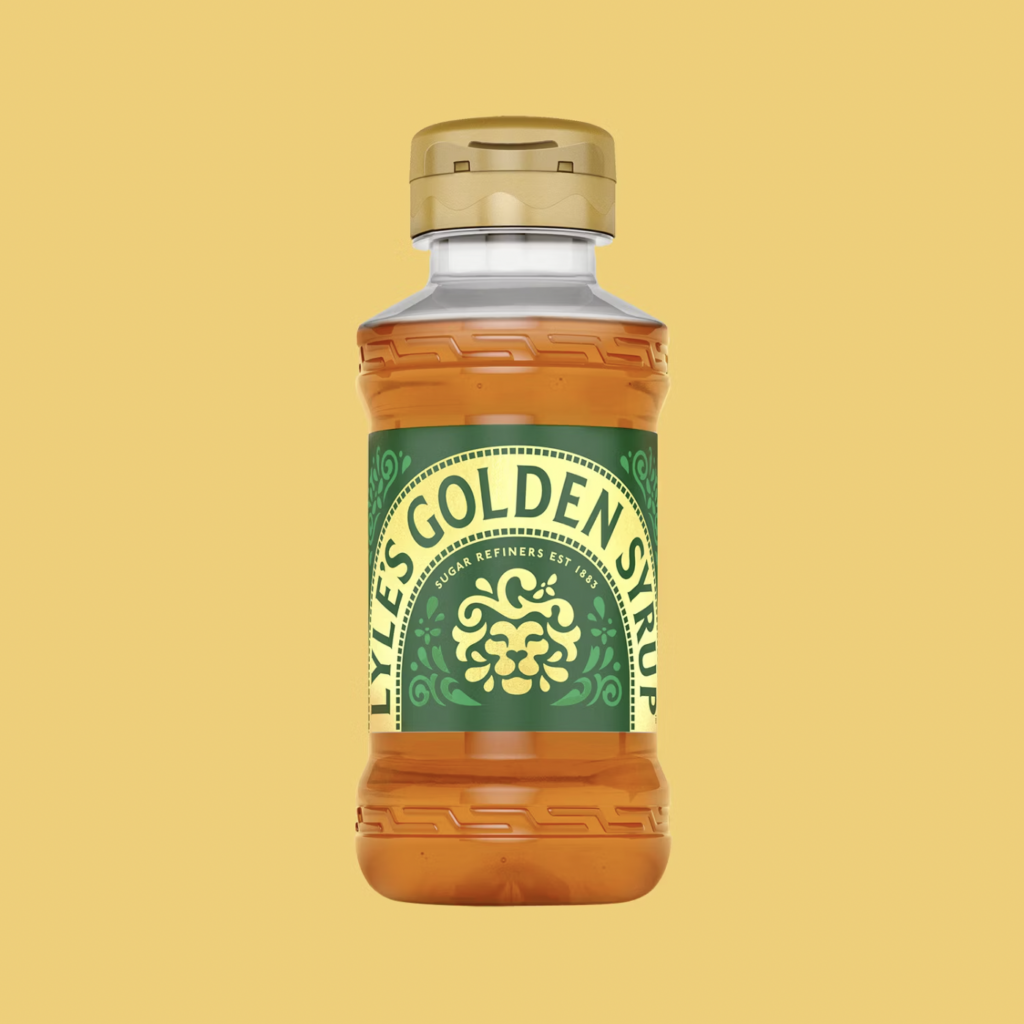
Many British households will have a sticky tin of Lyle’s Golden Syrup lingering somewhere in their kitchen cupboards. What most people probably haven’t noticed – until now – is that on the front of it is an intricate illustration of a lion carcass surrounded by insects, flanked by the line ‘Out of the strong came forth sweetness’.
Designed in 1883, two years after founder Abram Lyle first launched the product, both the illustration and the wording are a reference to a passage in the Bible. “Lyle had strong religious beliefs, which is why the tin’s famous logo depicts strongman Samson’s ‘lions and bees’ from the Bible’s Old Testament,” the brand explains on its website.
Virtually the same brand packaging has been in use for 141 years – bar a brief spell using cardboard during the first world war when all metal was redirected towards the war effort – and it is the Guinness World Record holder for the world’s oldest unchanged packaging.
“We are a firm believer in the saying ‘if it ain’t broke, don’t fix it’,” the brand says on its website, referring to the syrup recipe itself. However, it recently decided that something was – at least partly – broken in terms of the packaging design.

While the original lion carcass icon will remain in place on the brand’s syrup tins, it has unveiled new designs for other products in the Lyle’s Golden Syrup line sold in plastic bottles. The label of the squeezy bottle will now feature a flat design of a lion’s head, with ornate flourishes for a mane and a simpler typeface. This version is also being used as the primary version of the logo on its website, and builds on similar designs previously unveiled, such as its limited edition Coronation tin. The new designs are being rolled out from March onwards.

James Whiteley, brand director of Lyle’s, explained the change was about bringing the brand up to date with contemporary attitudes. “Our fresh, contemporary design brings Lyle’s into the modern day, appealing to the everyday British household while still feeling nostalgic and authentically Lyle’s,” he said.
While radical changes to branding often prompts strong responses, this move has triggered an especially loud uproar on social media (and GB News). Creatives have leveraged the argument that the new design is neither modern nor retains any of its heritage, and as a result falls into a middle ground that makes it entirely forgettable. The heritage element was noted by a descendant of Lyle on Twitter/X, who explained Lyle’s links to the design and said he felt a “loss” with the changes.
Many have also taken issue with the strategy, particularly the inconsistencies between the tins and other products featuring completely different designs (the lion motif is altogether absent from bottles for Lyle’s dessert toppings, which have no discernible logo and simply hero key flavours). With that in mind, the logic for the change certainly seems muddled, confusingly suggesting that it is good enough for one product but not the other.
Whatever people’s opinions on the new design, the process has been a masterclass in stoking fires where there were none. A rotting dead lion festering with bees is an image that most people would find repulsive, but without a compelling design to take its place, the change has been a rather sticky mess.
By Megan Williams 21/02/2024
Source: creativereview.co.uk