When launching a new venture, speed to market is crucial. Not only does it help people find you fast, but it starts building presence and impact.
This is even more important when launching an online identity in a saturated field, like the tech industry. With that in mind, when we developed the new branding for Simply Scale, we chose a vibrant colour palette to stand out in a sea of sameness.
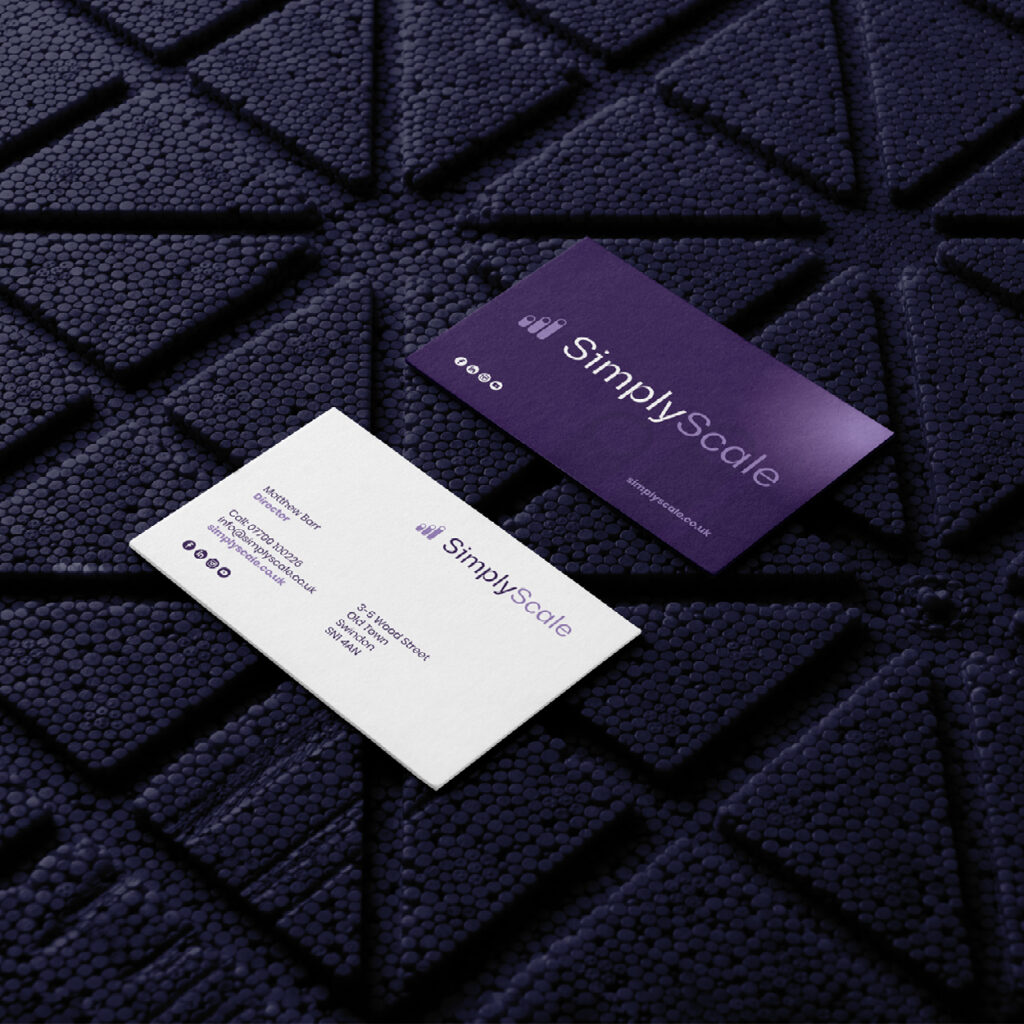
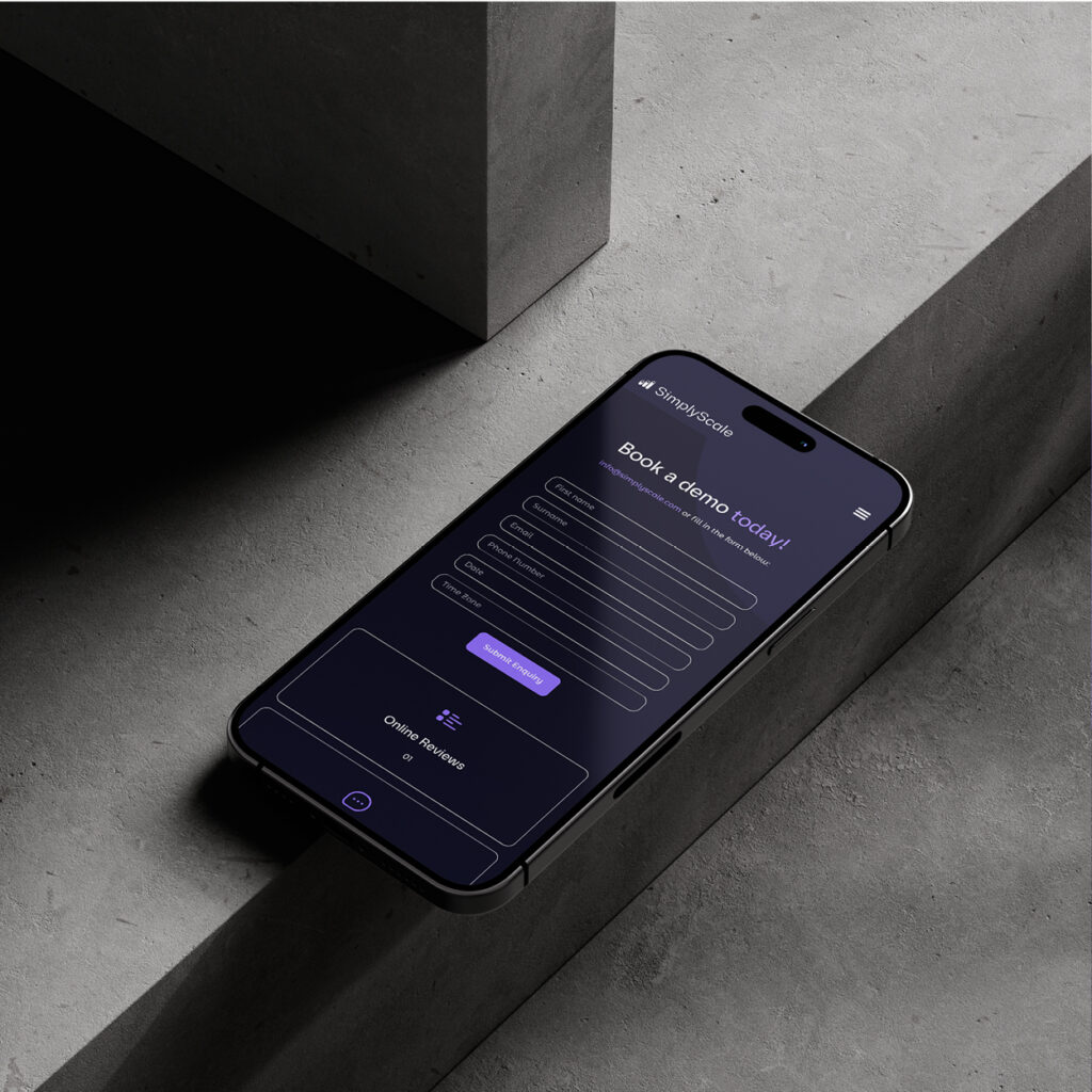
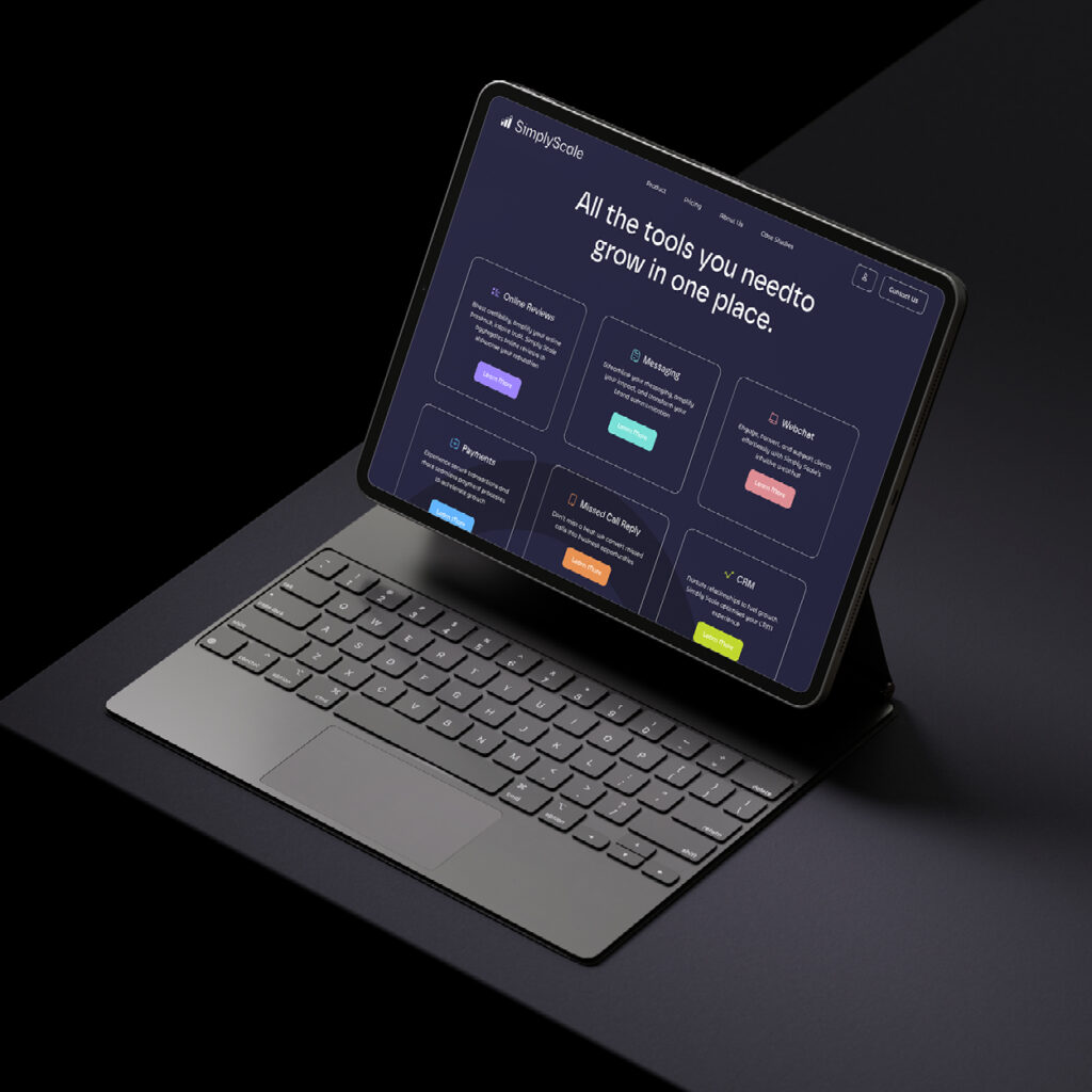
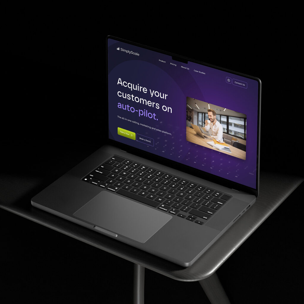
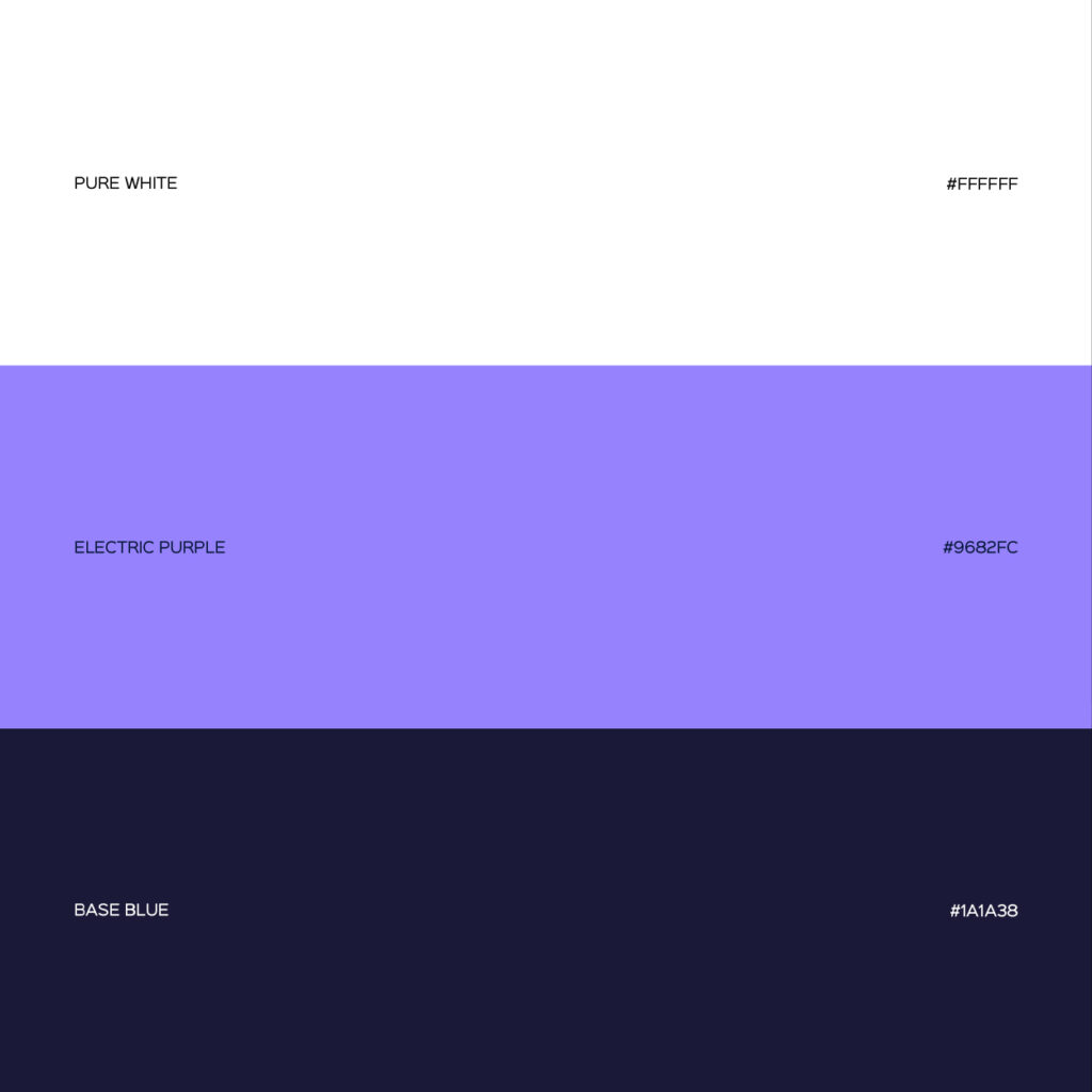


The vivid violet is a step away from conventional neutral tones, often seen on tech websites, and suggests a mysterious, but premium feel.
The website is striking too, matching Simply Scale’s ethos – ultra-simple, ultra-efficient and helps businesses unleash their full potential. Using a modern layout system and clean fonts, it simply and effectively communicates the company’s mission, products and pricing system.
Consistent? Check. Captivating? Check. Capable of gaining attention fast? Check!
Simply Scale have already been reporting new business leads. And we’re here for it.
Take a look at our brand case studies
Ready for your brand to stand out? For a FREE brand review, speak to one of our brand consultants today. Call our friendly team on 01793 847300 or email nathan@jazzbones.co.uk