Client
Sector
Charity
Services
Visit
- Background
Brighter Futures is a fundraising team of five based at the Great Western Hospital in Swindon. As the GWH’s charitable arm it supports the hospital’s strategic goals and fundraises in the local community.
As a charity, it relies on fundraising appeals and events to raise money for key equipment, research, training and improving the hospital environment.
One example of Brighter Futures’ impressive achievements is its recent Radiotherapy Appeal which raised an incredible £2.9 million.
- The Challenge
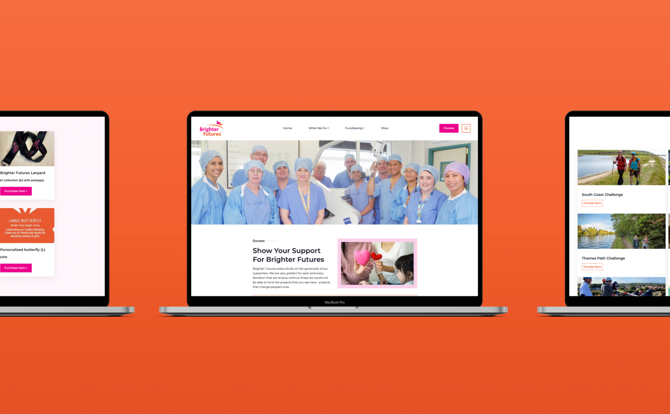
Brighter Futures were faced with a real challenge when their previous web developer stopped supporting a website which was also tired looking and needed a significant refresh.
Our challenge was to solve both of the above issues simultaneously in record time. The alternative was to literally leave Brighter Futures without a website. We also made the strategic decision to totally redesign the website rather than try to tinker around with the existing site.
As their previous system was too complex for them to manage the website effectively, we built a new website from the ground up using Reuben CMS (Content Management System).
This foundation gives Brighter Futures the tools to self-manage their website over time and communicate their ongoing goals and tasks more fluently.
- The Strategy
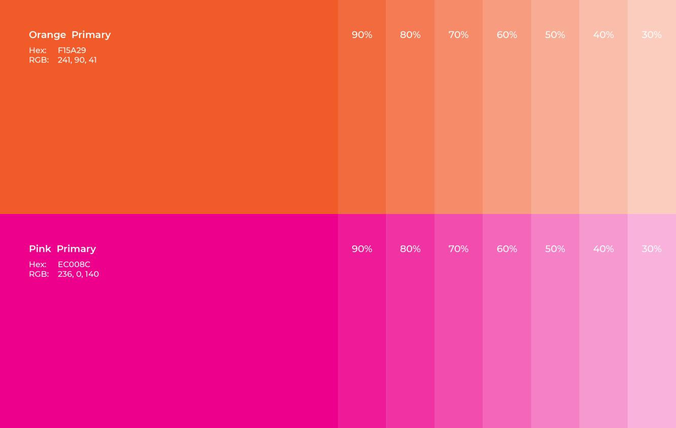
In terms of design, the colour palette is similar to the previous website, but we have developed some lighter tonal variations of the pink/orange to use as image borders and content section backgrounds.
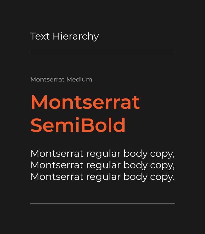
The font we have used is called Montserrat which was originally inspired by old posters and signs in the Montserrat neighbourhood of Buenos Aires, and is a modern urban typology. Montserrat is now featured in more than 20,000,000 websites worldwide.
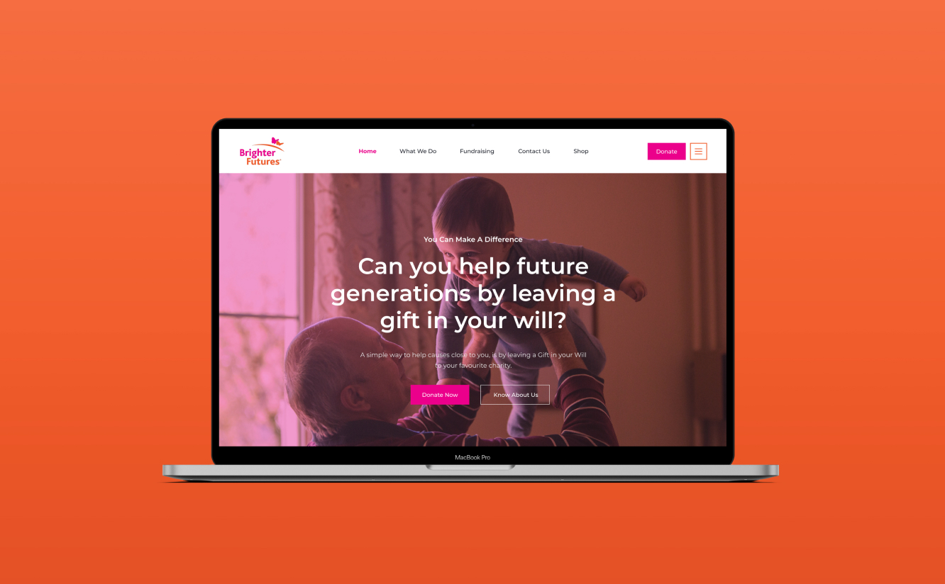
One of the main things we’ve done is to put the Appeals and Latest News into actual news sections (rather than content sections). This means all of this latest info is easily accessible on the homepage of the site and easier to navigate. Having regularly updated content on the front page also helps with SEO.
We’ve also added a hamburger menu to de-clutter the previous overhanging menu system, as well as eliminating old content that was cluttering the website. Our copywriters were also kept busy editing the existing copy, and proofing the whole site.


- The Result
Overall, the new website has an extremely clean and user-friendly design which is more in keeping with Brighter Futures’ innovative approach to fundraising and way of communicating with its many supporters.
Catherine Weaver, Fundraising Director at Brighter Futures said: “We were faced with a real dilemma and gave Jazzbones a real challenge; to rebuild our website and transform its design in a very short space of time. It’s fair to say they met that challenge head on and we are delighted with the results.”


© Jazzbones 2005—2024.
Registered In England No: 06586564
VAT Reg No: 891859463
Jazzbones Creative
Nexus Business Centre
Cheney Manor
Swindon SN2 2PN
Our website & hosting solutions
Jazzbones Creative
Nexus Business Centre
Cheney Manor
Swindon SN2 2PN