Business Biscuit – Brand Identity
Jazzbones was tasked with revitalising the Business Biscuit brand to better reflect its distinctive tone—professional, yet punchy, with a hint of funk.
Scope: Brand Identity, Brand Strategy, Logo Design, Brand Style Guide, Typography, Color Palette, Digital Design, Print Design, Website Design.

We were charged with totally refreshing the brand to give it a professional yet funky feel, suitable for the bitesize news stories that Business Biscuit specializes in.
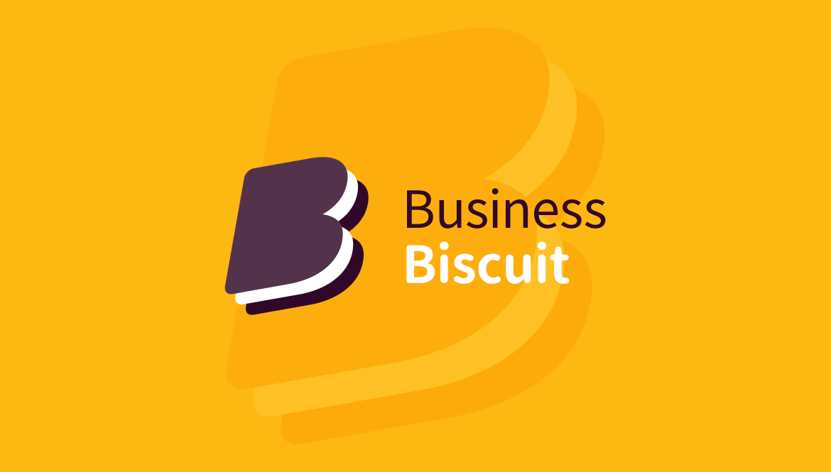
For the primary colour scheme, we chose to use a maroon flavoured brown combined with an understated yellow. These two colours are rich and vibrant, so work well digitally but they also work exceptionally well reproduced in print.
We also use a secondary palette of green, red and blue which used sparingly across the website’s spacious white background highlight different areas (news, property, appointments, etc.).

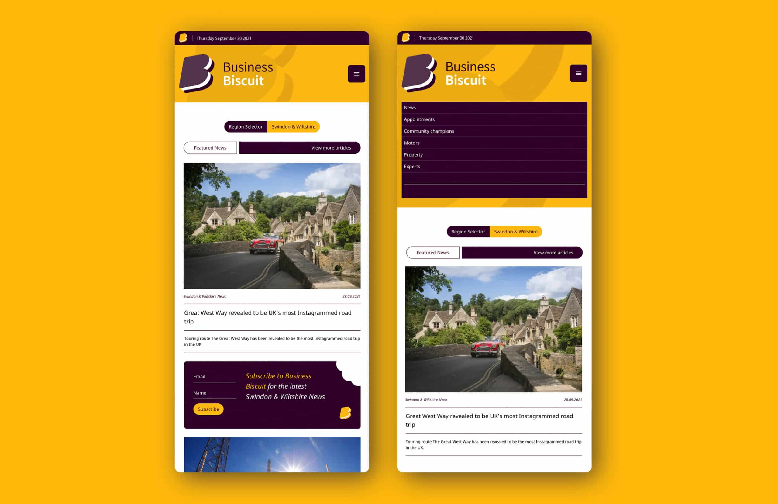
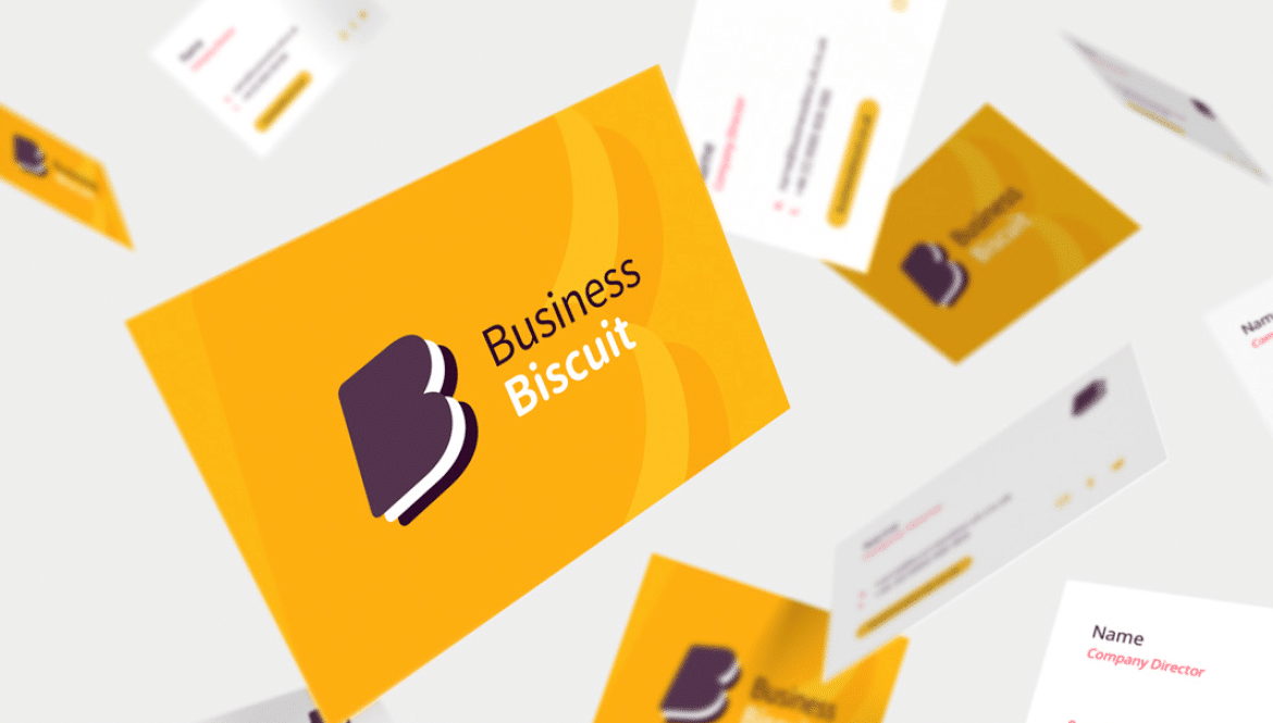
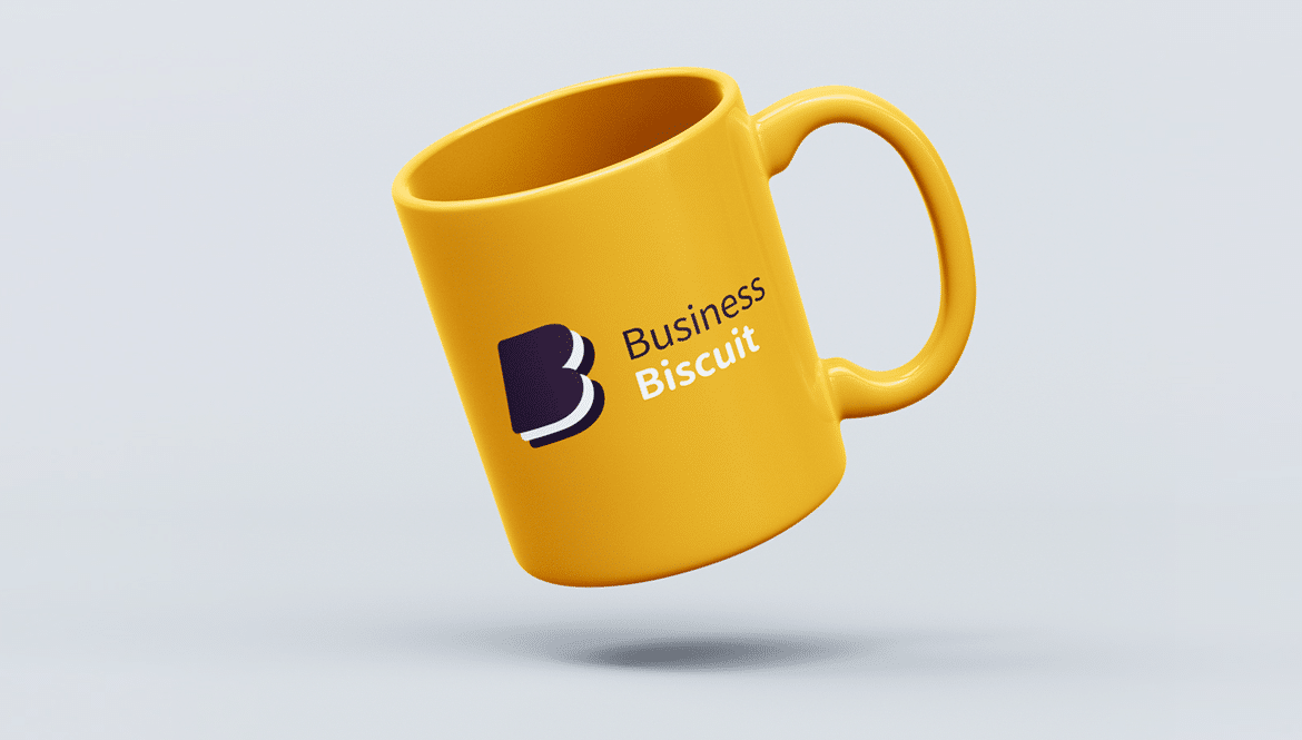
We shaped a letter B that hinted at an Oreo type layered biscuit, brown on the outside and white on the inside. By eliminating the two broken Bs from the original logo we were able to stack the words business and biscuit across two lines, making the overall feel much more streamlined.
Crucially, the new streamlined logo is a digital asset that can be used across the platform and works splendidly at any size.
Biscuit Business now has a brand, logo, website and social assets that set them up nicely to realize their ambitious plans to expand beyond Swindon and Wiltshire into Bristol, Bath and then Berkshire.
West
Darby Close
Cheney Manor Estate
Swindon
SN2 2PN
01793 847300

© Jazzbones 2005—2024.
Registered In England No: 06586564
VAT Reg No: 891859463
Jazzbones Creative
Nexus Business Centre
Cheney Manor
Swindon SN2 2PN
Our website & hosting solutions
