Client
Sector
Business to Business
Services
Visit
- Background
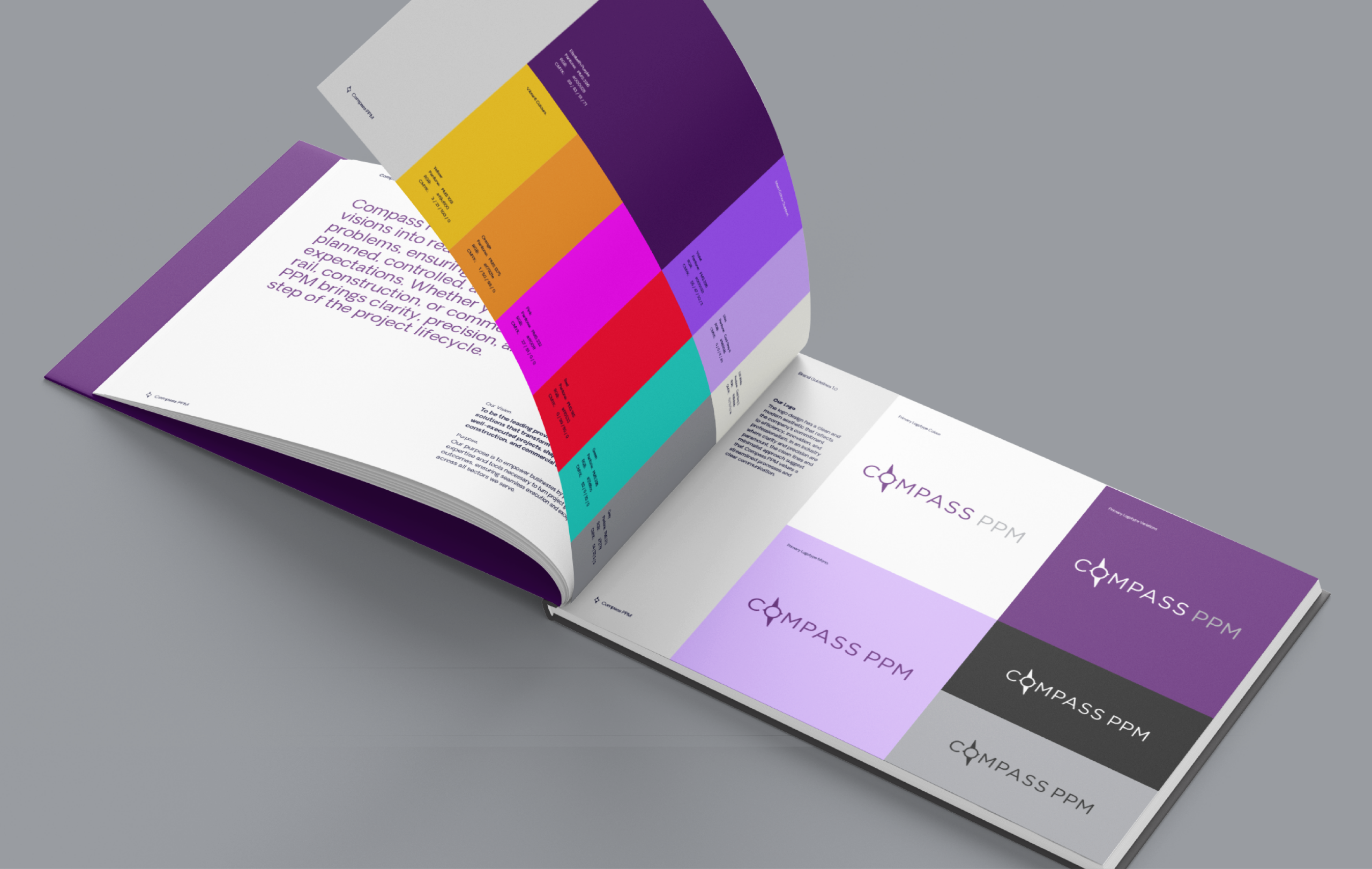
At Jazzbones Creative, we specialise in developing impactful brand identities that empower businesses to make their mark. Our work with Compass PPM, a challenger startup in the project portfolio management sector, exemplifies this commitment.
- The Challenge
Compass PPM, founded by highly experienced industry directors, sought to disrupt the project portfolio management market with a brand that would stand out in a sea of sameness. As a new entrant, they needed a striking, versatile brand identity to capture attention and communicate their forward-thinking approach.
- The Strategy
To ensure Compass PPM made a bold impression, we collaborated closely with their leadership team to define a unique and memorable brand. The creative direction was underpinned by their desire to lead the market with innovation, reliability, and adaptability.


- The Result
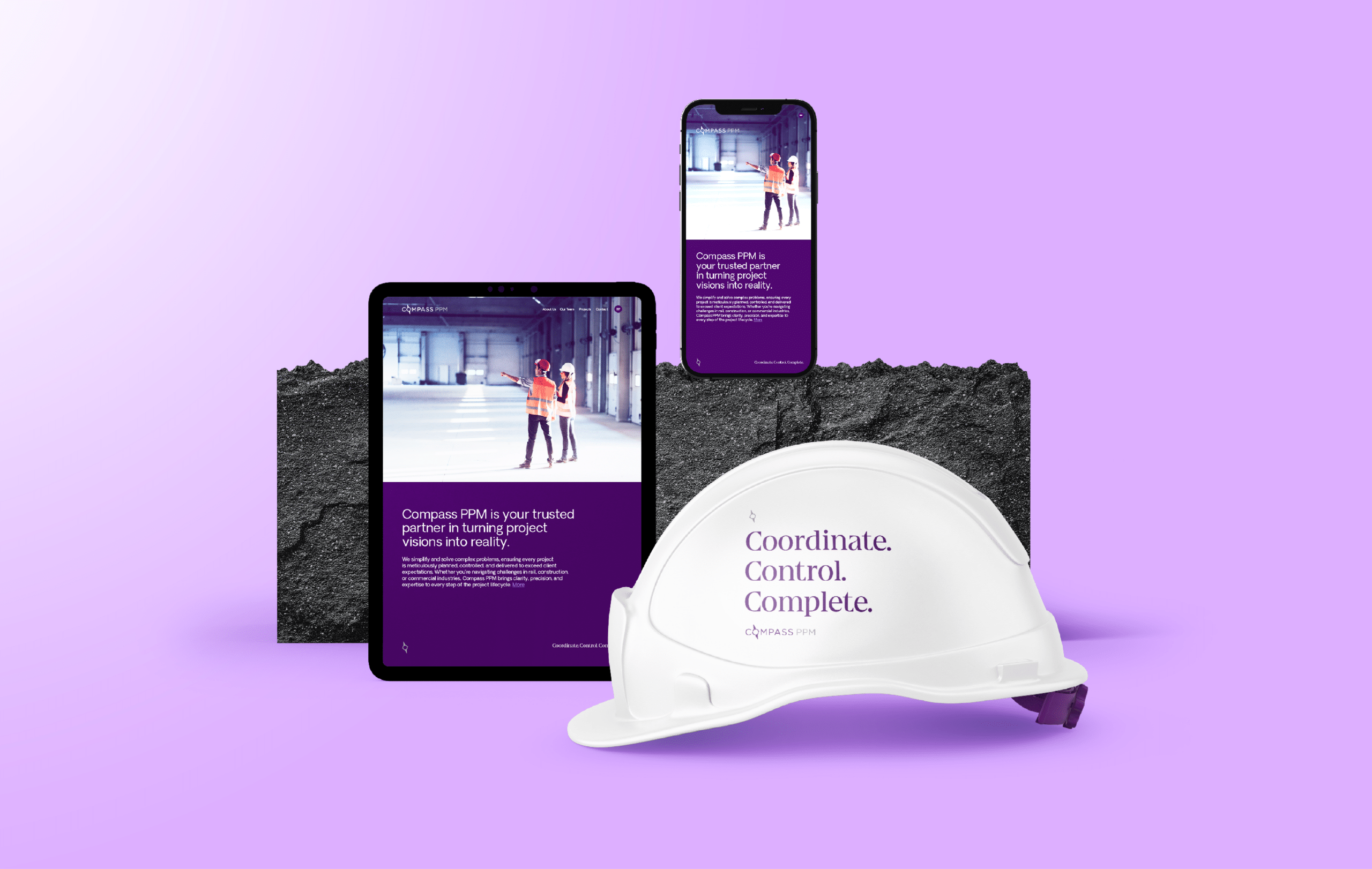
The result is a cohesive and versatile branding framework that seamlessly translates across communication channels, from traditional print materials to digital platforms such as their website and social media. Compass PPM’s new brand identity has not only set them apart from competitors but also positioned them as a confident, forward-thinking player in the project portfolio management space.


© Jazzbones 2005—2024.
Registered In England No: 06586564
VAT Reg No: 891859463
Jazzbones Creative
Nexus Business Centre
Cheney Manor
Swindon SN2 2PN
Our website & hosting solutions
Jazzbones Creative
Nexus Business Centre
Cheney Manor
Swindon SN2 2PN