Direct Healthcare Solutions – Brand Identity
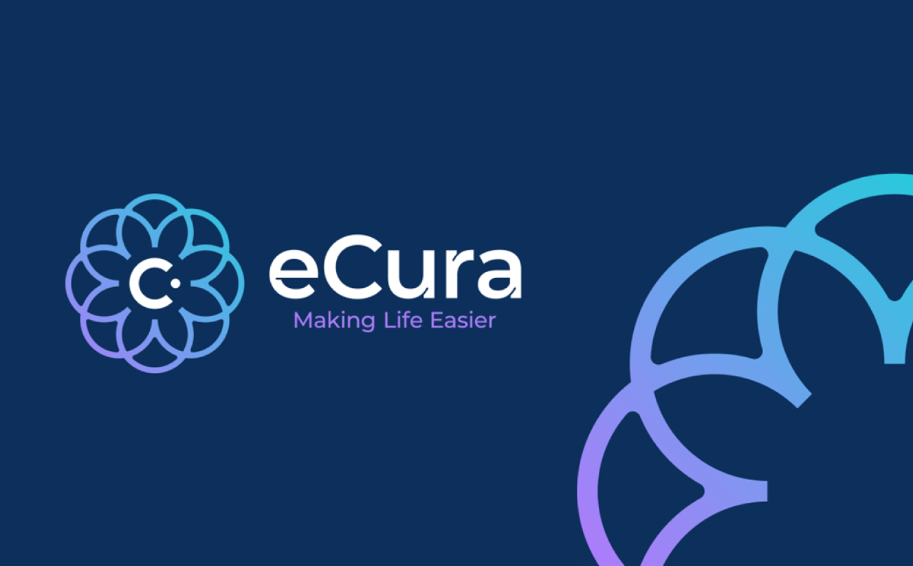
From our offices in Swindon we worked with the team at Direct Healthcare Solutions to create a full brand strategy and identity. We worked closely with the team in Swindon to deliver the new brand eCura.
The decision to rename and rebrand was taken in order to differentiate DHS from a larger competitor with a similar name and to make sure their brand was fit-for-purpose ahead of planned geographical expansion beyond their South West base (their UK HQ is in Swindon).
After getting to know DHS’ raison d’être, personality and USPs, the first part of our brief was to come up with a new name. Our copywriting team provided multiple options broken down into different genres and the eventual winner was eCura.
eCura is an innovative name that contrasts with the more traditional descriptive names of most other companies in the health sector. The origin of the name comes from the Latin word ‘cura’ (cure)’. Placing the ‘e’ before it makes the word unique whilst the ‘ec’ suggests eco which sits nicely with the sustainable ethics that are very much part of the company’s genes.
Along with the name, we created a new strapline, ‘Making life easier’. This homed in on what eCura does in practice, which is make life easier for their clients, staff, partners and ultimately the end users of their equipment. For example, people who need a hoist to move from a bed to a chair or bathroom.
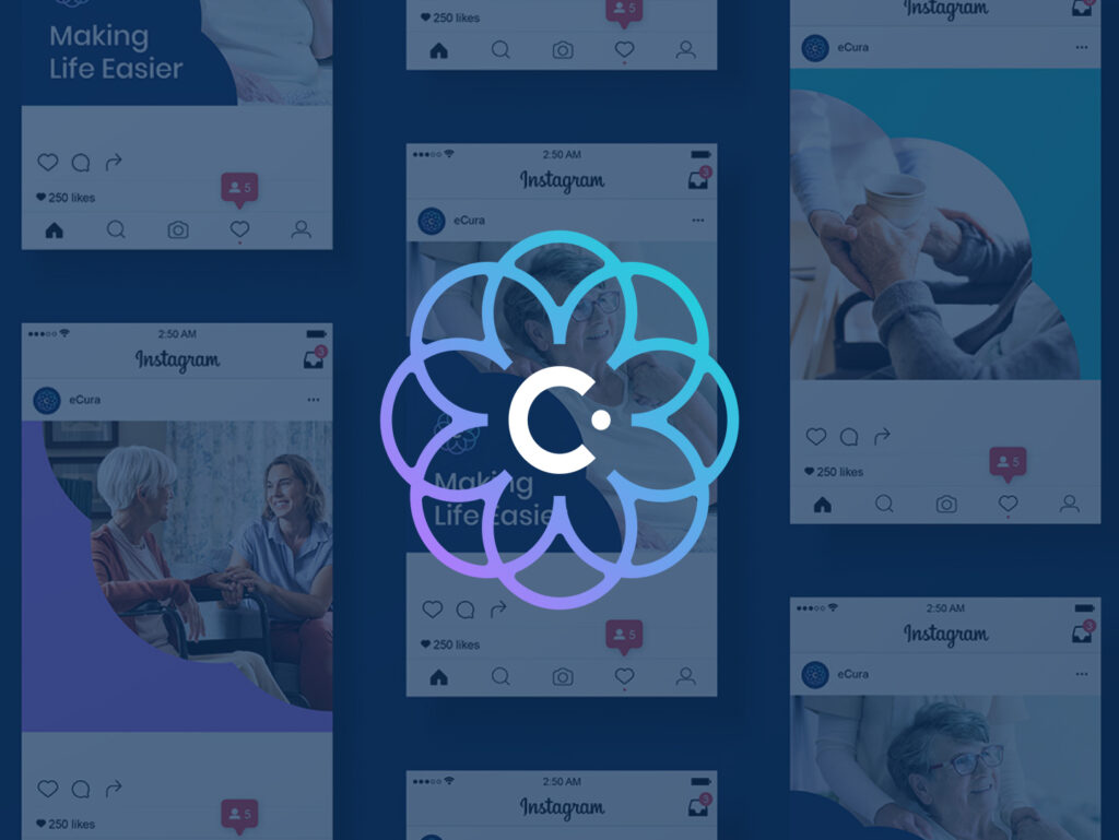
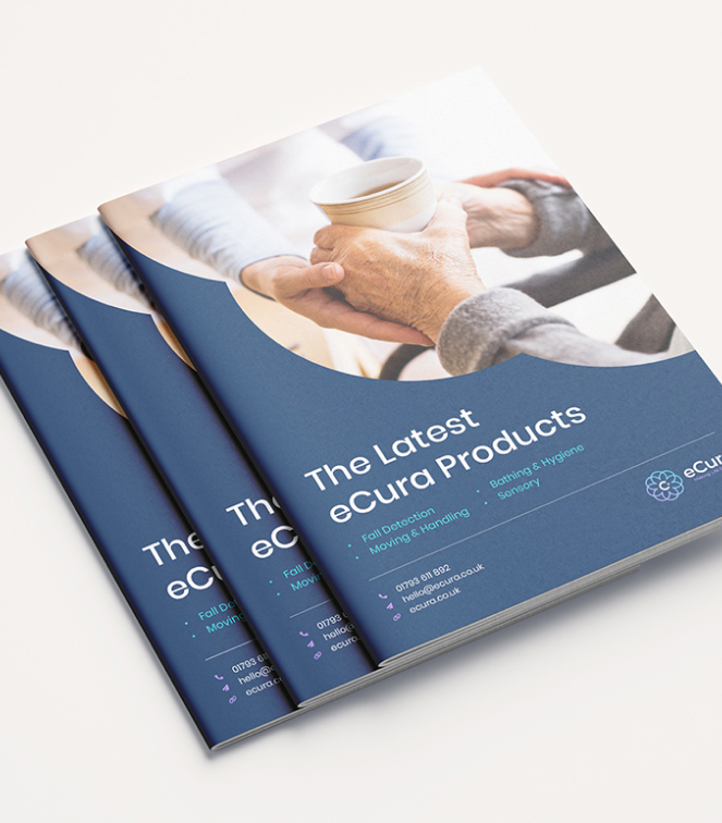
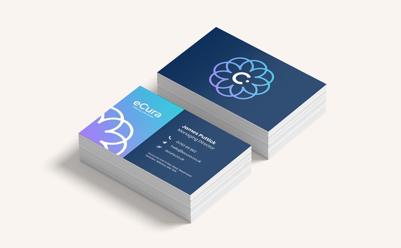
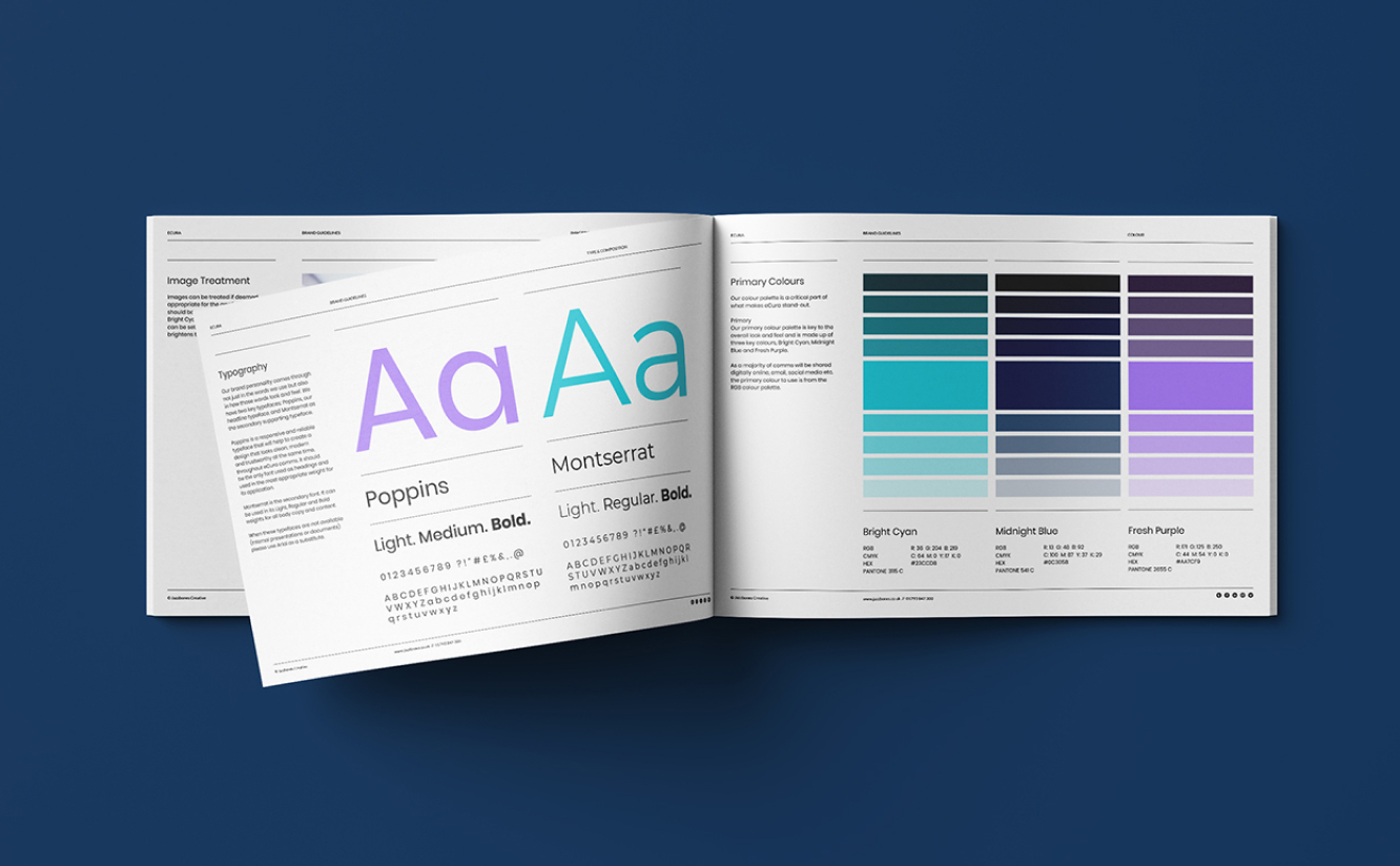
To help eCura implement their new brand, we have supplied them with an exhaustive Brand Guidelines book, covering everything from use of the new logo to typography, colour, tone of voice and image treatment. And as soon as the new branding was approved, we began to generate brand assets like business cards, compliments slips, email signatures, social media visuals, product brochures and vehicle wrapping. Watch this space for the website!
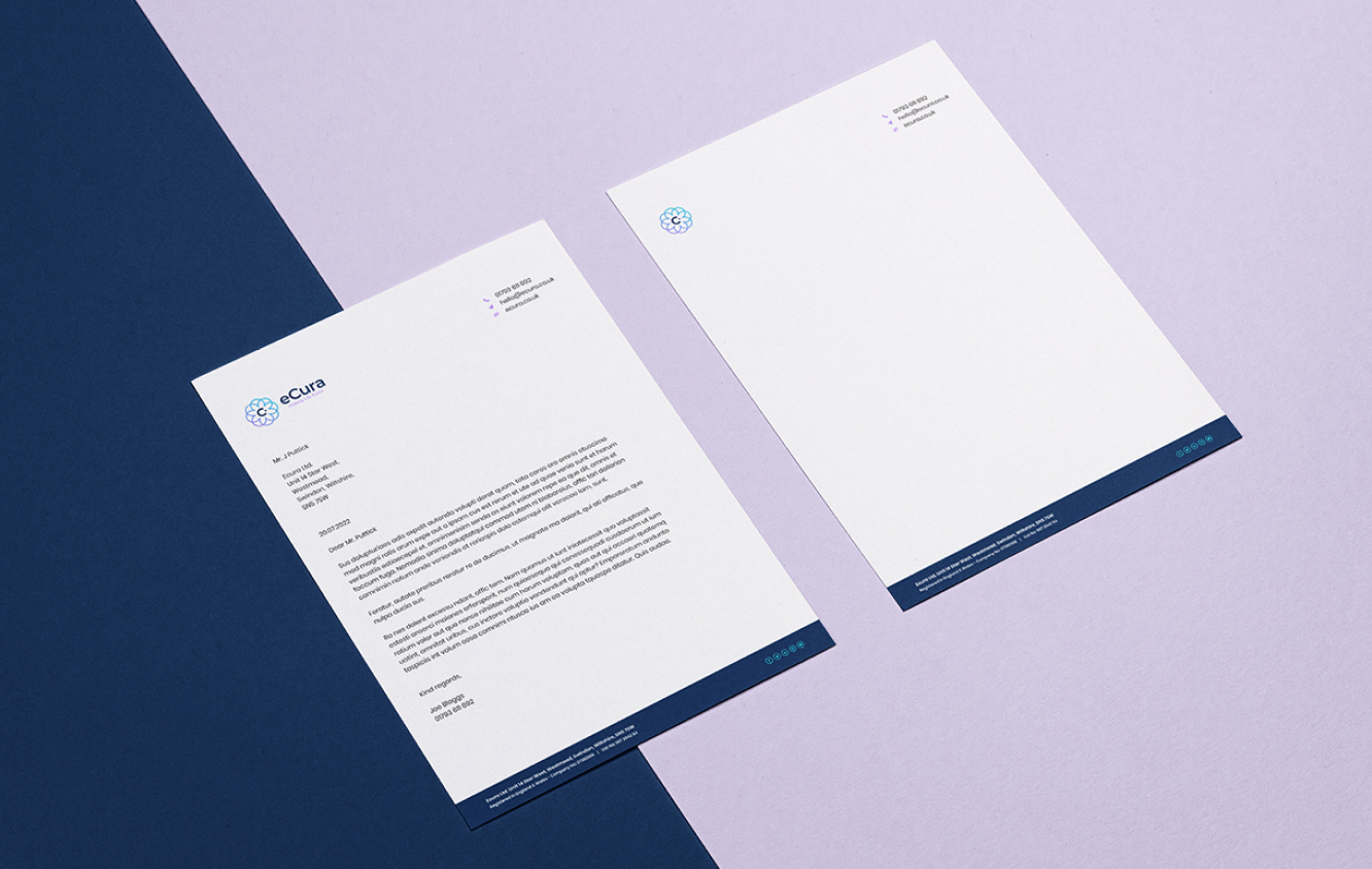
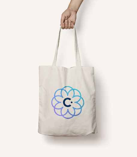
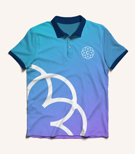
Visually, eCura has a fresh new look that is a total break from the past. Their brand-new logo is made up of a vibrant eCura wordmark inside a ‘flower’ symbol. In its simplicity, natural feel and immediacy, it is designed to work perfectly in any setting, from traditional print to social media.
A new primary colour palette is also key to the overall look and feel and is made up of three key colours, Bright Cyan, Midnight Blue and Fresh Purple. Again, very distinctive. In terms of imagery, wherever possible eCura will use images of real people in real situations, as opposed to product images or staged photos.
West
Darby Close
Cheney Manor Estate
Swindon
SN2 2PN
01793 847300
© Jazzbones 2005—2024.
Registered In England No: 06586564
VAT Reg No: 891859463
Jazzbones Creative
Nexus Business Centre
Cheney Manor
Swindon SN2 2PN
Our website & hosting solutions