Client
Sector
Business to Business
Services
Visit
- Background
There’s nothing more rewarding than helping a start-up with big aspirations. Especially when they have a solid set of values, such as honesty, collaboration and positivity.
So, when sustainable Edge Cloud Solutions provider Solu Solutions approached us for a new brand identity, we were all over it.
- The Challenge
Our task was to develop a brand identity for Solu Solutions, aligning their values and vision to create a look and feel that would merge their business intuition and technology expertise for a powerhouse of impact.
Solu would then have the visual consistency and confidence to approach the market with their unique sustainable Edge Cloud Solutions.
- The Strategy
We got to work fast, starting with a brand workshop, where we took a deep dive into their objectives, USPs and customer demographics. In these discovery sessions, no stone is left unturned, and we consider everything to ensure brand longevity and loyalty, today and tomorrow.
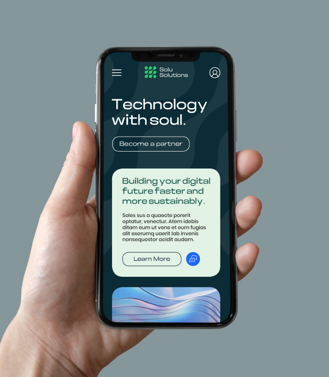
We listened to the team’s short and long-term strategic goals and created the strapline ‘Technology with Soul’ to convey their pioneering, innovative spirit.
- The Result
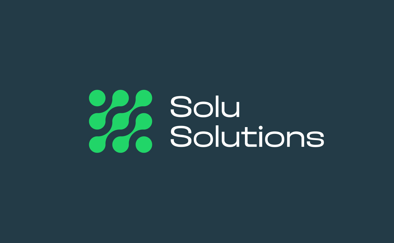
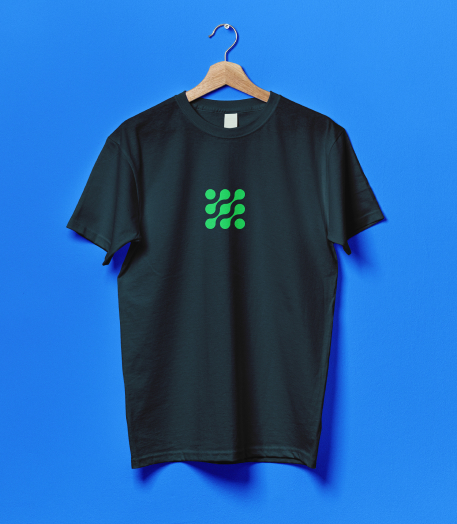
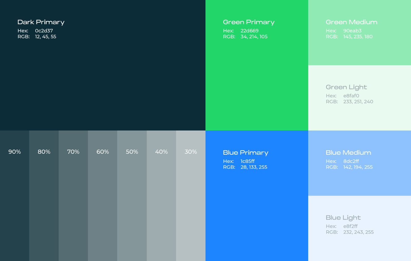
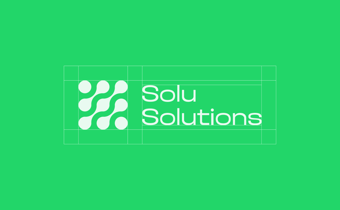
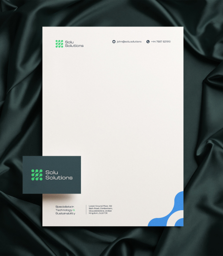
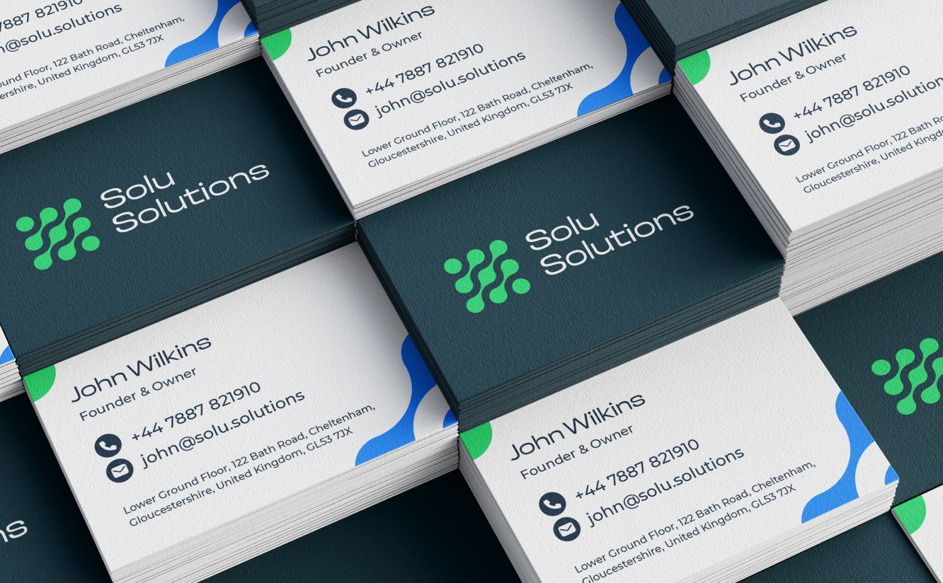
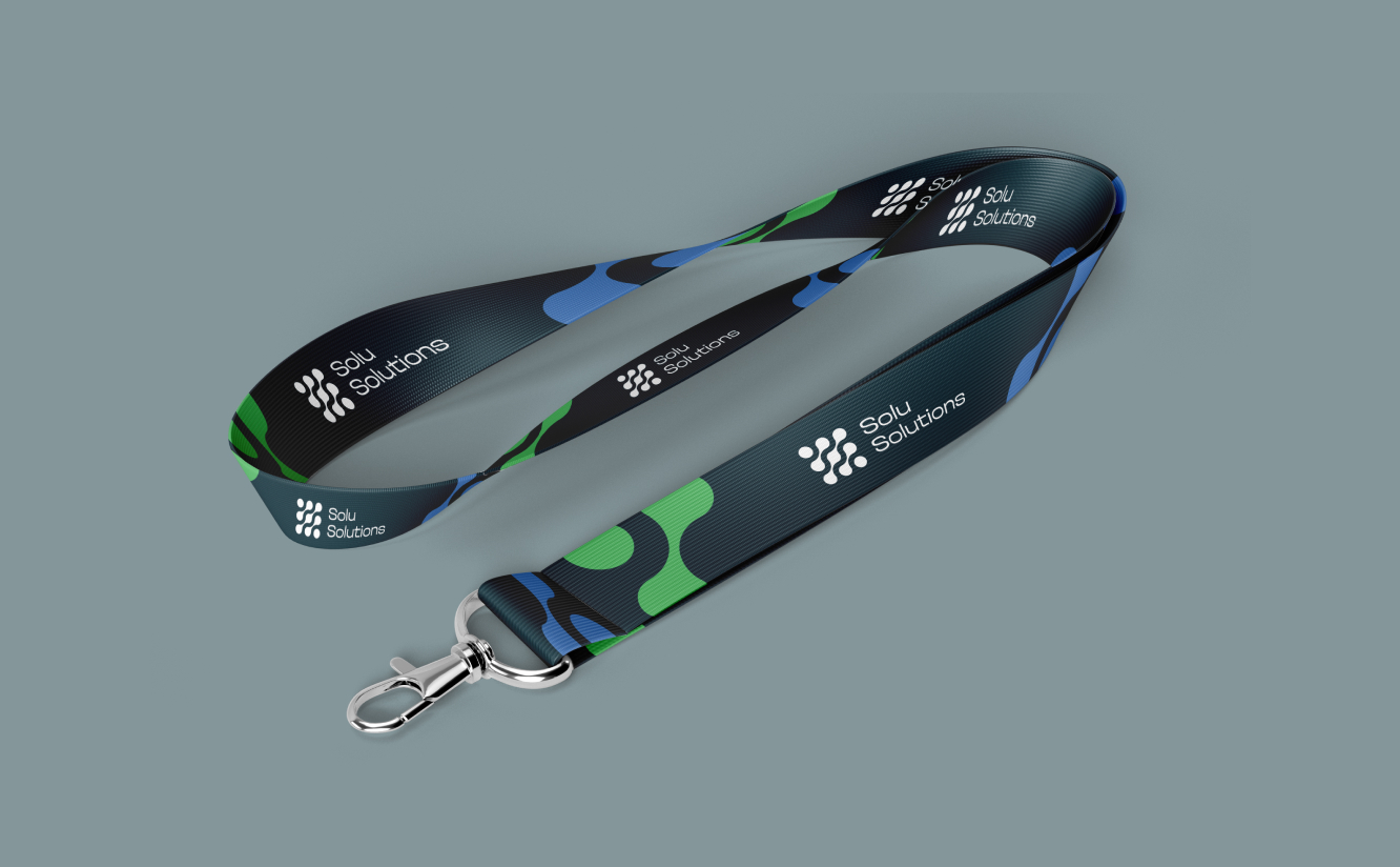
Taking on board all of the insights from the brand workshop, we crafted a logo for Solu that reflects their ethos and brand persona. It’s a bold, modern expression melding their digital and technological expertise, future-ready for tomorrow’s markets. The design features a series of dots, which interconnect to symbolise the synergy and integration between the different components of the business. Each dot signifies a vital element of their ecosystem, demonstrating how they seamlessly link sales strategies, sustainability and collaboration with their respective partners.
© Jazzbones 2005—2024.
Registered In England No: 06586564
VAT Reg No: 891859463
Jazzbones Creative
Nexus Business Centre
Cheney Manor
Swindon SN2 2PN
Our website & hosting solutions
Jazzbones Creative
Nexus Business Centre
Cheney Manor
Swindon SN2 2PN