White Horse Housing – Brand Identity
White Horse Housing has been providing affordable homes in the villages of Wiltshire, Swindon, and surrounding areas for over 35 years. When they approached Jazzbones to refresh their brand identity, we jumped at the chance to help this respected housing association better reflect the heart of its mission.
Working closely with key stakeholders at WRHA, we developed a set of creative routes and visual templates based on WRHA’s rural and sustainable credentials, and also its inclusive working practices. On October 1st, 2016 WRHA were officially relaunched as White Horse Housing.
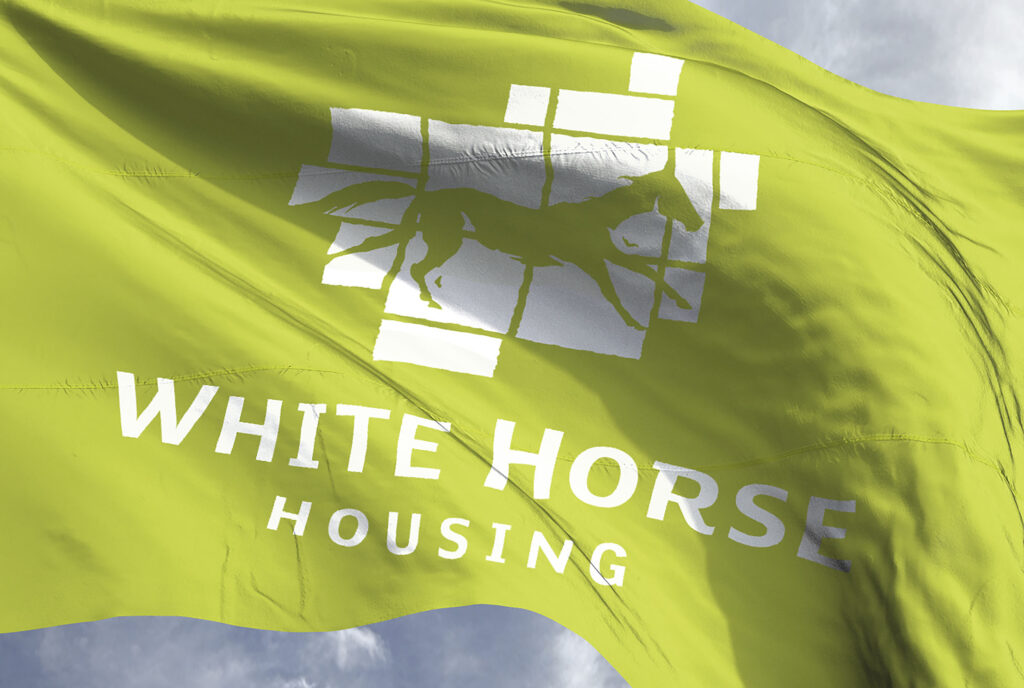
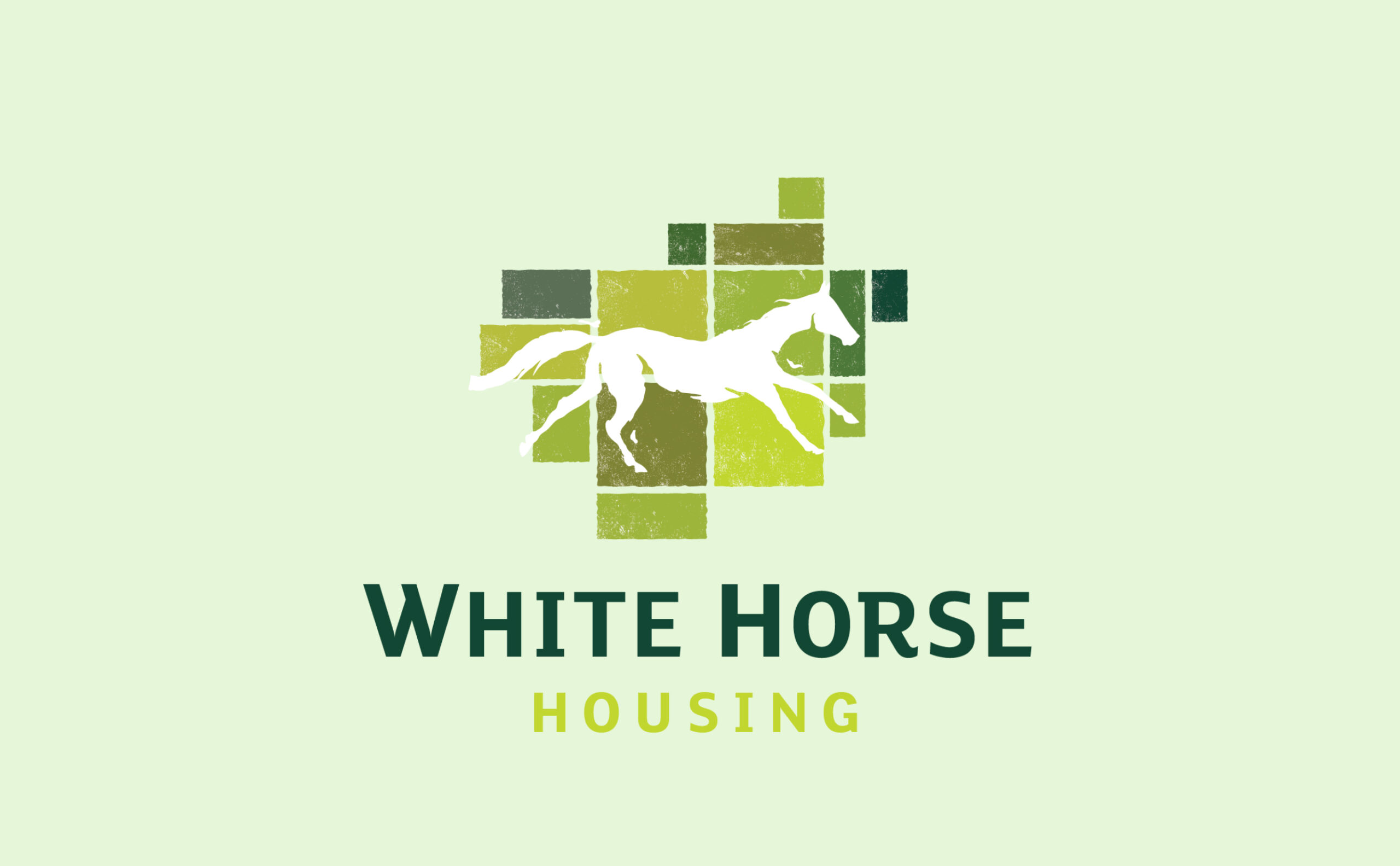
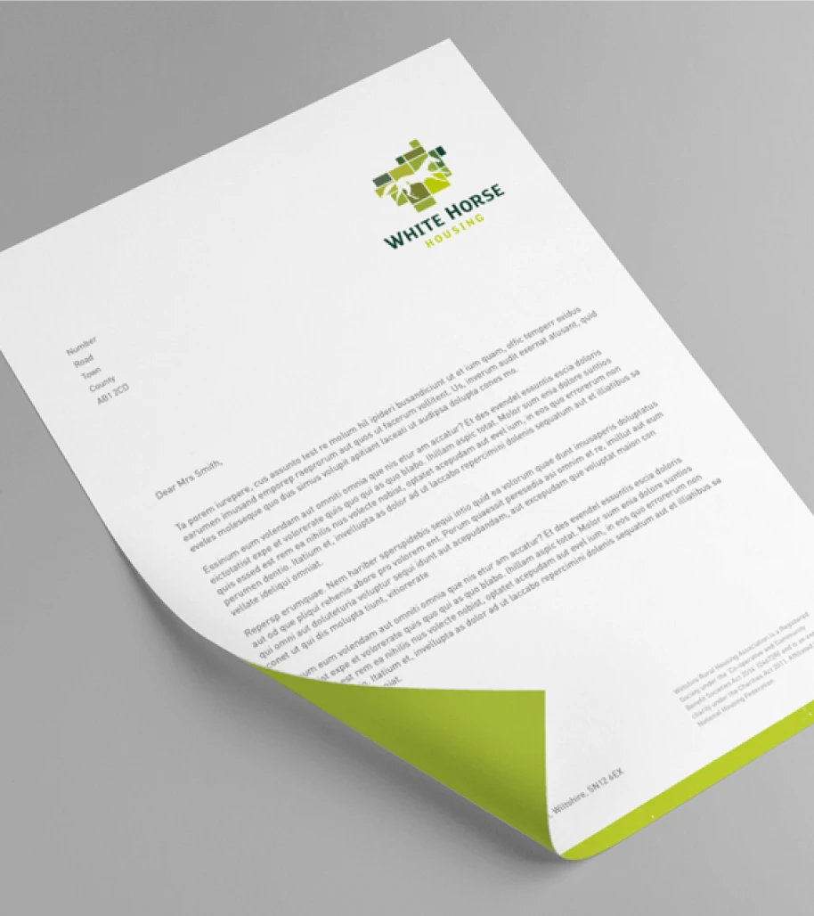
It was important to maintain the charity’s rural feel, even though White Horse’s geographic spread has now changed. The White Horse is synonymous with Wiltshire but also the South West. We’ve designed the logo and other marketing materials to reflect the iconic white horses of the area without being too location specific. Framed by green pastures that evoke rolling fields or a brickwork pattern, it’s a flexible visual asset for the White Horse brand moving forward.
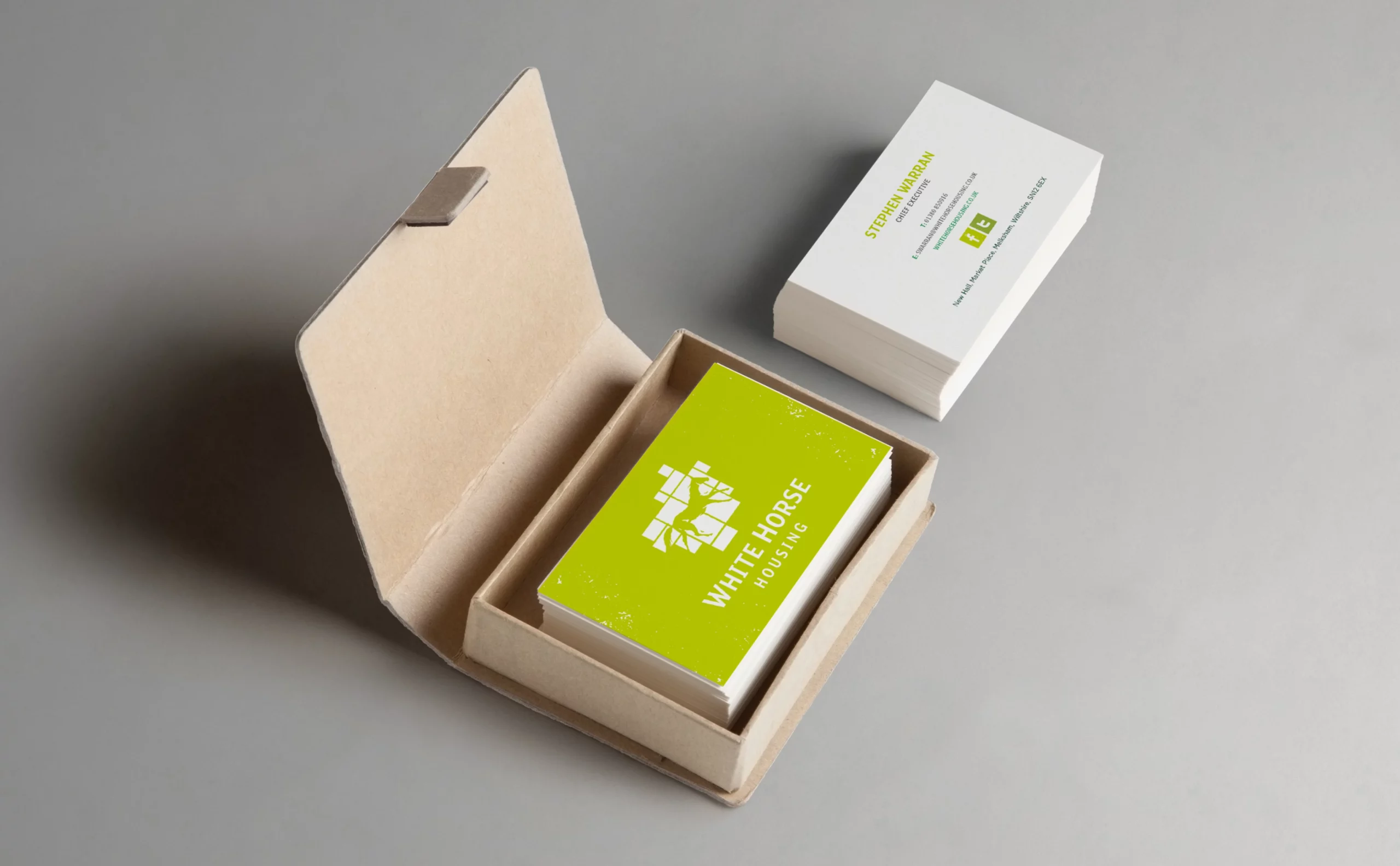
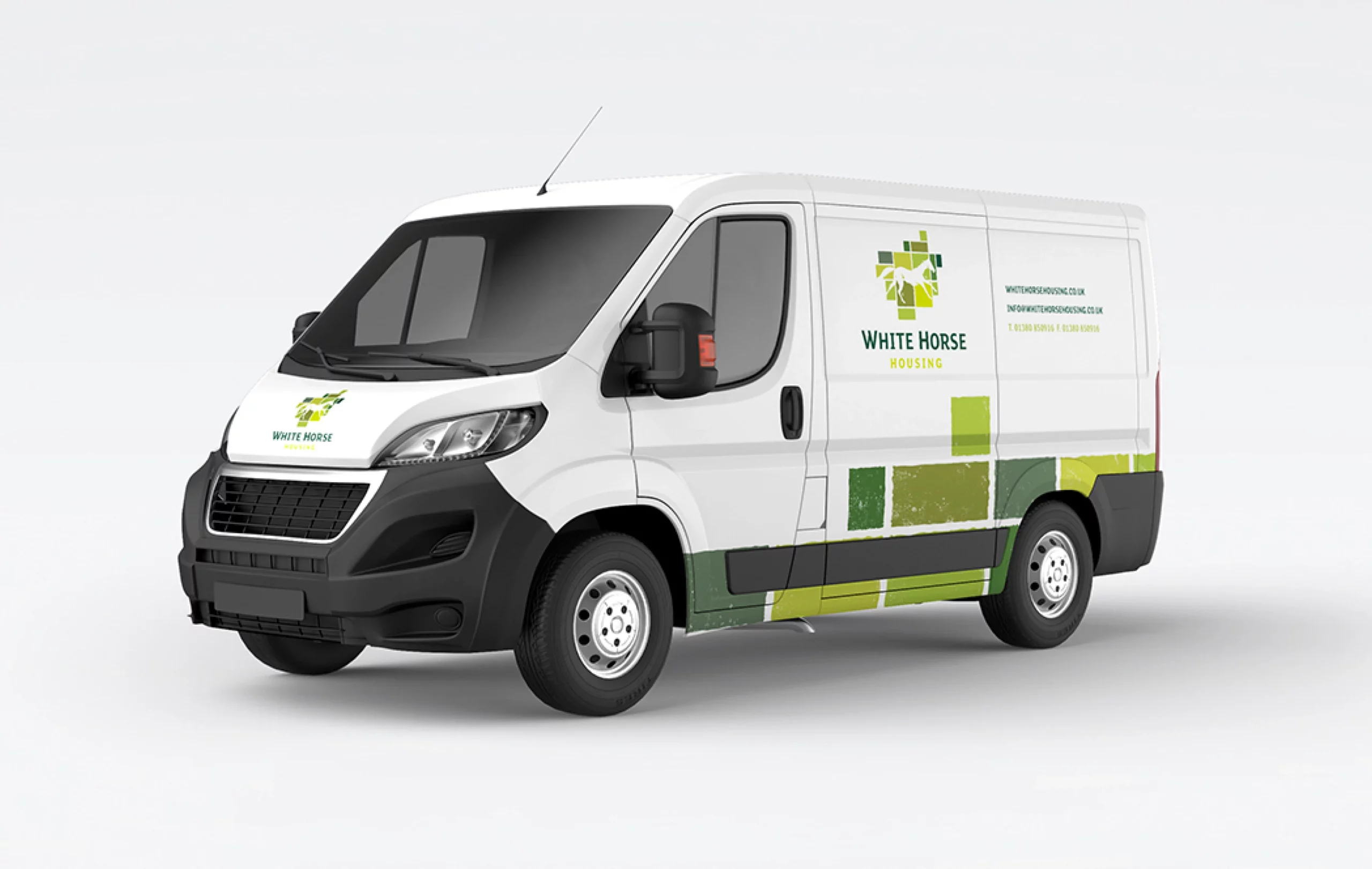
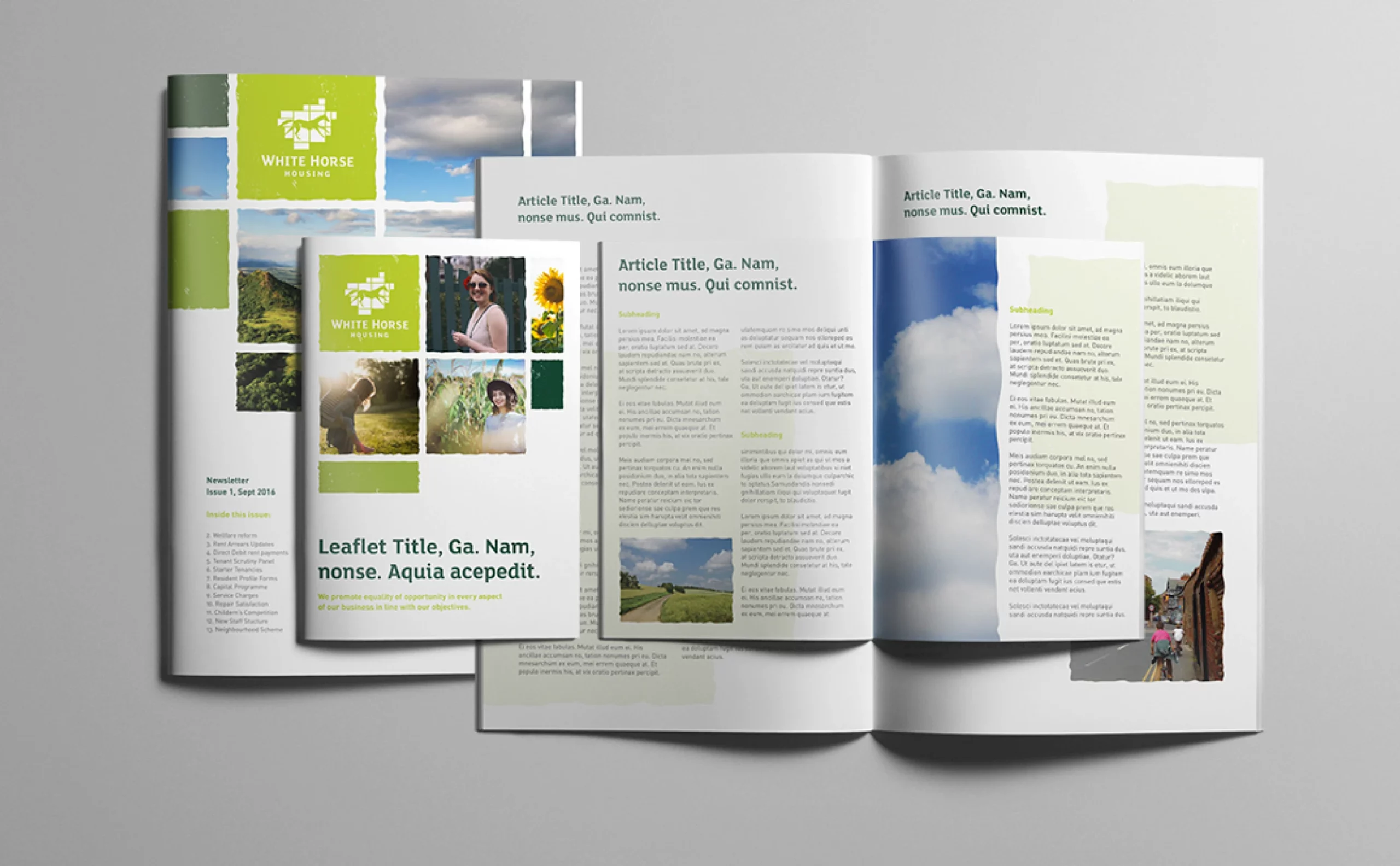
Sometimes charities come to Jazzbones with a one-off project for example, a quick-fire fundraising campaign in response to a particular emergency, but the White Horse Housing brief involved a host of disciplines: brand strategy, naming and logo, brand identity, photography, design templates. It’s the kind of wider campaign brief we relish. Especially when it’s for a good cause!
West
Darby Close
Cheney Manor Estate
Swindon
SN2 2PN
01793 847300

© Jazzbones 2005—2024.
Registered In England No: 06586564
VAT Reg No: 891859463
Jazzbones Creative
Nexus Business Centre
Cheney Manor
Swindon SN2 2PN
Our website & hosting solutions
