How Wolff Olins and adam&eveDDB Reimagined a Banking Giant’s Identity
Lloyds Bank, a cornerstone of British financial services, has recently unveiled a comprehensive rebrand that aligns its heritage with the demands of modern digital banking. In a collaboration with global branding consultancy Wolff Olins and creative agency adam&eveDDB, Lloyds launched a fresh brand identity, supported by a multi-channel advertising campaign. This rebrand not only repositions the bank visually but also marks a significant shift toward a more customer-centered, experience-led future.
In this blog, we’ll break down how the Lloyds rebrand came to life, what makes it stand out, and how it can inspire your next creative project.
Heritage Meets the Future: The Thinking Behind Lloyds’ Rebrand
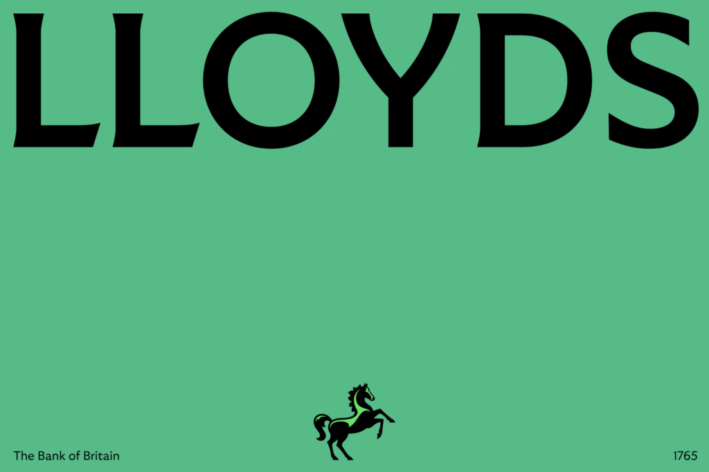
Lloyds Bank is no stranger to reinvention, but its latest rebrand is perhaps its most ambitious yet. Wolff Olins, the creative force behind the project, sought to maintain the bank’s long-standing image of trust and stability while modernizing it to meet the digital age’s demands. The iconic black horse remains central to the bank’s identity, but with a crucial twist—it’s now facing forward, symbolizing progress and looking ahead to the future Suresh Balaji, Lloyds’ Chief Marketing Officer, described the rebrand as “experience-led,” emphasizing that the bank’s identity is about more than just visual aesthetics. It’s about creating a seamless and empowering experience across all touchpoints—from their banking app to in-branch interactions. This holistic approach aligns with Lloyds’ vision of moving everyone forward, positioning the bank as a partner in customers’ financial journeys.

From Classic to Contemporary: The Visuals of Lloyds’ Rebrand
The rebranding process involved refining the core elements of the Lloyds brand without losing its established identity. At the heart of the refresh is the iconic black horse, a symbol that’s been part of Lloyds’ visual identity for over 250 years. In this iteration, the horse faces forward, a subtle but powerful change that represents the brand’s commitment to helping customers progress and take control of their financial futures.
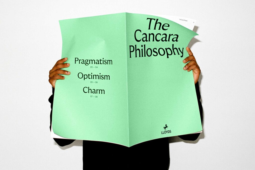
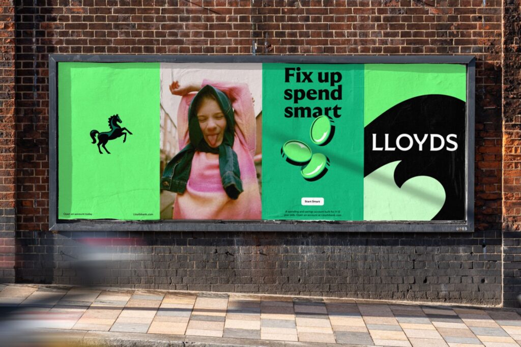
Beyond the horse, Wolff Olins and adam&eveDDB introduced a cleaner, more streamlined logo and typography, making the brand more adaptable to digital spaces. This shift reflects a broader trend in design toward simplicity and versatility, ensuring that the brand looks as good on a mobile screen as it does on a billboard. The color palette has also been refreshed with modern shades of green, reinforcing a sense of reliability while injecting new energy into the brand.
Experience-Led Design: Bridging the Gap Between Brand and User
Perhaps the most innovative aspect of Lloyds’ rebrand is its focus on “experience-led” design. As Balaji pointed out, “Modern brand building is more than advertising. A brand is the sum total of all experiences.” This ethos is reflected in the brand’s renewed focus on customer experience—whether through its intuitive app or seamless in-branch interactions.
The rebrand is not just about looking good; it’s about functionality. The Lloyds app has been given a massive update as part of the rebrand, integrating user-friendly features that give customers more control over their finances. The tagline “The power to do it all” perfectly encapsulates this shift, positioning the bank’s app as a comprehensive financial tool that can handle everything from budgeting to investment tracking.
This experience-led approach is a critical takeaway for businesses in any sector. A brand is no longer just a logo or a catchy slogan; it’s the cumulative effect of every interaction a customer has with your business. For creatives, this shift is a reminder that design should always be user-centric, considering not just aesthetics but also functionality and user experience.
What Can We Learn from Lloyds’ Rebrand
For creative agencies and brands alike, Lloyds’ rebrand offers several valuable lessons:
- Balancing Heritage with Innovation: Lloyds successfully maintained its historical identity while pushing its brand into the future. This is a fine line many brands have to walk, especially those with long-standing reputations. The key takeaway here is to preserve the elements that make your brand recognizable while embracing change.
- User-Centric Design is Key: Lloyds’ shift toward experience-led branding is a reminder that today’s consumers value more than just aesthetics. They want brands to simplify their lives and empower them with intuitive, functional design. For digital agencies like Jazzbones, this highlights the importance of integrating user experience (UX) design principles into every project.
- Consistency Across Channels: The new Lloyds identity is not just limited to one platform; it extends across digital, social, and traditional media. This consistent, multi-channel presence is something every brand should aim for. It ensures that your message is reinforced no matter where your audience interacts with you.
Lloyds Bank’s rebrand is a masterclass in how to evolve an iconic brand for the modern world. By partnering with Wolff Olins and adam&eveDDB, Lloyds has managed to balance tradition with forward-thinking design, creating a brand that feels both timeless and fresh. For creative professionals, the campaign is a powerful reminder of the importance of blending aesthetic appeal with user-centric design principles.
At Jazzbones, we’re always inspired by bold, innovative rebrands like this one. If you’re looking to revitalize your own brand or create something entirely new, let Lloyds’ journey remind you of the power of thoughtful, experience-driven design.
Ready to move your brand forward?
Reach out to us today and let’s craft something amazing together!

